The Challenge
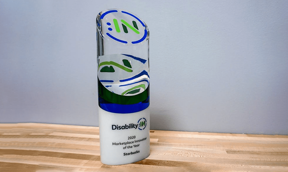
Our team had to highlight this unique and profound company in a way that elevated their brand. It also had to be a design that they could be truly proud of.


Our team had to highlight this unique and profound company in a way that elevated their brand. It also had to be a design that they could be truly proud of.

The response we received was wonderful. Large corporations earning high accolades for their Disability:IN scorings were happy to be honored with something that mirrored their impressive efforts. The top recipients were recognized for their vendor diversity and disability indexes.
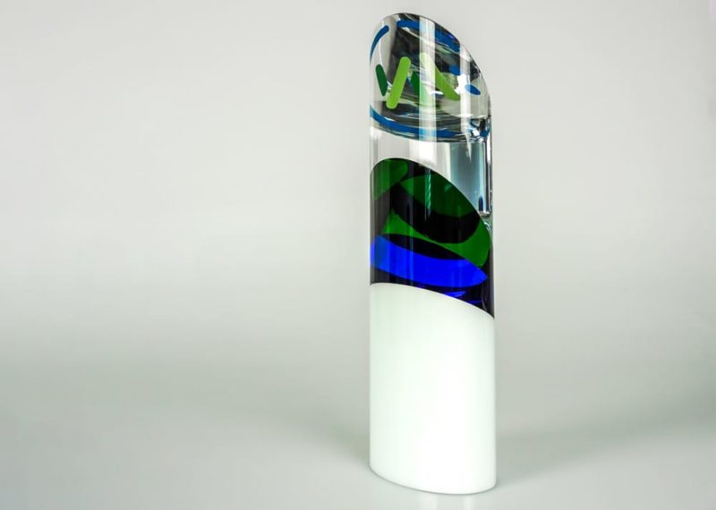
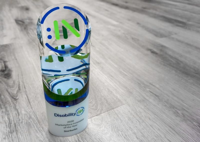
We used white, clear, blue and green crystal, ultimately using four different materials. Our team combined them in a way where the colors did not cannibalize each other, allowing their branding to shine. It was a very custom work of art.